Paket Gambar
Dengan akses ke lebih dari 400 juta foto, vektor, ilustrasi, dan banyak lagi. Mencakup gambar buatan AI!
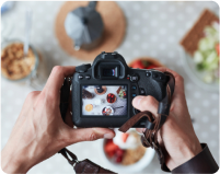
Paket video
Pustaka yang berisi 28 juta klip video berkualitas tinggi. Pilih antara paket dan langganan.
Paket Musik
Unduh lagu satu per satu, atau dapatkan langganan dengan unduhan tanpa batas.


Serenity
Serenity is a cool blue almost gray hue that evokes a sense of peace and tranquility. The hue is achieved by mixing blue with white and just a touch of red. As you might expect from a color with this name, serenity can help you find peace in today's otherwise turbulent landscape. The color that best complements serenity is the one exactly opposite on the color wheel: rose quartz. Together, rose quartz and serenity reflect connection and well-being. However, being such a subtle color, serenity also pairs well with other mid-tones, such as deep and light purples, deep greens, rich browns and shades of yellow and pink. Serenity is easy to class up with glitzy accents such as crystal chandeliers, silver or gold fixtures and mirrored surfaces. Because serenity is such an understated color, you can find a home for it in any room. Use it in your dining room via table settings or linens. Create a shower backsplash in serenity-colored tiles, or incorporate it in your baby girl's room. Serenity works especially well in bedrooms, as the color instantly signals to your brain that it's time to take a breath and wind down. Serenity is a quiet color and is therefore ideal for any space in which you want to evoke a sense of calm. Though any space can benefit from its serene effect, the hue works best in living rooms and bedrooms.
#91A8D0
#91B5D0
#667F92
#ECF7FF
#D8EFFF


Find more colors
Dapatkan alat kreatif dan inspirasi

Teori Warna yang Dijelaskan untuk Pemasar dan Pemilik Bisnis Kecil

Panduan Lengkap tentang Warna dalam Desain
Pelajari semua hal yang perlu Anda ketahui agar bisa menggunakan warna dalam desain dengan baik. Pelajari teori warna, arti warna, dan mode warna untuk membantu Anda memilih palet yang tepat untuk karya Anda.

35 Lapisan Tekstur Majalah Gratis

Siap untuk mulai mendesain?
Coba Shutterstock Editor, aplikasi desain yang mudah dan efisien. Buat postingan media sosial, promosi yang tampak profesional, dan lain-lain.
